Writing & Designing with the <picture> element
In this demo-lecture:
- What are
<img>and<picture>? - Responsive images with
srcset
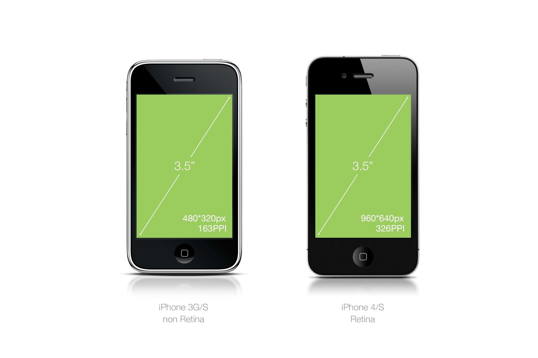
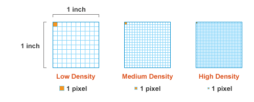
Pixel Density
&
Responsive images with srcset
The problem: Our device ecology
Higher the density => More data =>
Consider range of devices & data plans
Responsive media sources
Using the appropriate image size and file size impacts user experiences
- Ensure images don't break layouts
-
Choose image based on:
- pixel density
- device's network & O.S.
- screen size
Create a range of resolutions for each image file
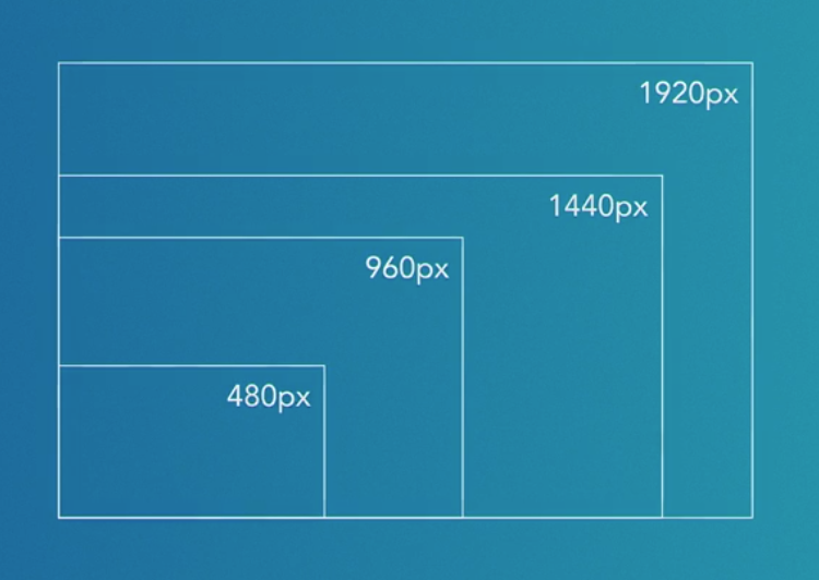
srcset with pixel density parameters
See the Pen 05_03B — Responsive Images, srcset part 1 by Jen Simmons (@jensimmons) on CodePen.
srcset with image width parameters
See the Pen 05_04A — Responsive Images, sizes by Jen Simmons (@jensimmons) on CodePen.
srcset & sizes
with media queries
See the Pen 05_04B — Responsive Images, sizes by Jen Simmons (@jensimmons) on CodePen.
Review
img elements now have the following attributes and values to render responsive images to a range of devices:
- srcset
- -> pixel density: 1x, 2x, ...
- -> image width: 480w, 980w, ...
- sizes with media queries
These are all new img
element features, but ...
What can the picture
element do?
picture Element
source element
See the Pen 05_05A — Responsive Images, picture by Jen Simmons (@jensimmons) on CodePen.
Combining techniques
sourcewithsrcset- image width syntax, e.g.,
320w
- Simmons' Codepen